Have you ever noticed how the blue color never feels too much? A bright red wall can feel overwhelming, and neon shades can quickly become tiring, but blue almost always feels easy to look at. Maybe that’s why people connect blue with calm skies, deep oceans, quiet evenings, and peaceful spaces.
Some colors demand attention. Blue doesn’t have to. It naturally stands out without feeling loud. Next, it can feel rich, bold, and powerful. That’s what makes it different from almost every other. Here are some interesting facts about blue, the psychology behind the color blue, the different shades of blue and what they represent, the best blue color combinations, etc.
Fascinating historical facts about the blue color
- The history of the color blue goes back thousands of years, but blue was once one of the rarest and most expensive colors in the world.
- Unlike red or brown pigments found easily in nature, the ancient blue color was difficult to create, which made it a symbol of wealth, royalty, and importance.
- The origin of the blue color can be traced to ancient Egypt, where blue pigments were used in jewelry, pottery, statues, and tomb paintings.
- Egyptians believed blue represented protection, spirituality, heaven, and divine power. They also created one of the earliest synthetic pigments, Egyptian blue.
- A major part of blue pigment history is linked to lapis lazuli, a rare, deep blue stone mined mainly in Afghanistan.
- Artists crushed lapis lazuli into powder to create ultramarine blue, one of the most valuable pigments in history.
- During the Middle Ages and the Renaissance, blue became strongly associated with royalty, luxury, and religion across Europe.
- One of the most famous examples of the meaning of blue throughout history is the Virgin Mary, who was often painted wearing rich blue robes in Christian art.
- Artists used expensive ultramarine blue for the Virgin Mary to symbolize purity, holiness, honor, and grace.
- Since blue pigments were extremely costly, only wealthy patrons, royal families, and important religious artworks could afford them.
- Over time, scientists developed synthetic blue pigments that made blue more affordable and widely available.
- As blue became easier to produce, it started appearing more in fashion, interior design, branding, printing, and modern art.
- Today, blue is one of the most popular colors in the world and is commonly associated with calmness, trust, professionalism, confidence, and stability.
The psychology behind blue
Blue is one of those colors people naturally feel connected to. Maybe that’s why blue often feels calm without even trying.
Think about how different blue feels depending on where you see it. A soft light-blue room can feel instantly relaxing and airy. A deep navy blue suit looks confident and professional. Bright electric blue feels modern and energetic, while dusty blue shades feel cozy and comforting. The mood completely changes with the shade.
Blue is also the color that many people trust the most. That’s why so many brands, apps, form builders, banks, airlines, and tech companies use it. Blue feels dependable, clean, stable. It doesn’t scream for attention, but it still stands out. When people see blue in a logo or website, they often feel a sense of comfort without even realizing it.
But blue also has a softer emotional side. We say things like “feeling blue” when we’re sad or emotionally drained. Even blues music became popular because it captured heartbreak, loneliness, and deep emotions in such an honest way.
Interestingly, blue is not a color people usually connect with food. Naturally blue foods are rare, so blue plates or bright blue foods can sometimes reduce appetite instead of increasing it. That’s very different from colors like red or orange, which usually feel warmer and more energetic.
Different shades of blue and their meanings
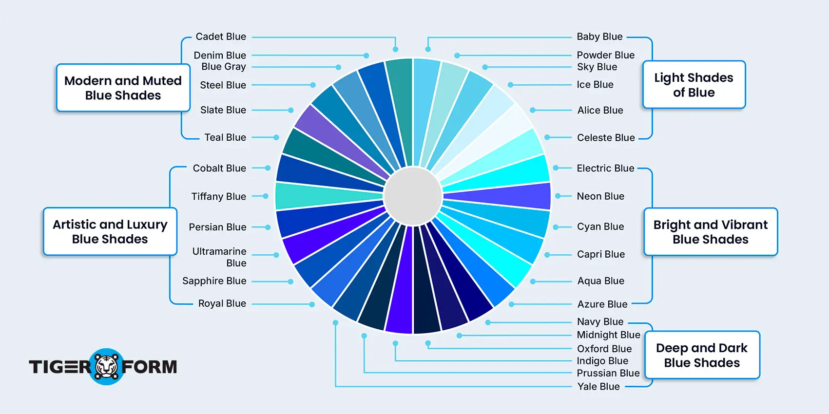
| Category | Shade of Blue | Meaning & Common Associations |
| Light Shades of Blue | Baby Blue | Softness, innocence, calmness, and comfort |
| Powder Blue | Elegance, subtlety, and sophistication | |
| Sky Blue | Freedom, openness, peace, and creativity | |
| Ice Blue | Freshness, clarity, coolness, and minimalism | |
| Alice Blue | Cleanliness, simplicity, and gentle aesthetics | |
| Celeste Blue | Serenity, positivity, and airy visual appeal | |
| Bright and Vibrant Blue Shades | Electric Blue | Energy, innovation, boldness, and futuristic design |
| Neon Blue | Youthfulness, nightlife, creativity, and digital aesthetics | |
| Cyan Blue | Clarity, technology, freshness, and modern visuals | |
| Capri Blue | Tropical energy, vibrancy, and vacation-inspired aesthetics | |
| Aqua Blue | Refreshment, liveliness, and ocean-inspired themes | |
| Azure Blue | Brightness, optimism, and openness | |
| Deep and Dark Blue Shades | Navy Blue | Trust, professionalism, authority, and confidence |
| Midnight Blue | Mystery, luxury, elegance, and sophistication | |
| Oxford Blue | Intelligence, tradition, and formality | |
| Indigo Blue | Wisdom, spirituality, and depth | |
| Prussian Blue | Artistic richness, seriousness, and classic elegance | |
| Yale Blue | Academic prestige, stability, and professionalism | |
| Artistic and Luxury Blue Shades | Royal Blue | Luxury, confidence, richness, and authority |
| Sapphire Blue | Sophistication, elegance, and premium aesthetics | |
| Ultramarine Blue | Creativity, artistic depth, and historical significance | |
| Persian Blue | Royalty, cultural richness, and vibrancy | |
| Tiffany Blue | Exclusivity, luxury branding, and elegance | |
| Cobalt Blue | Bold creativity, expression, and artistic energy | |
| Modern and Muted Blue Shades | Teal Blue | Balance, sophistication, and modern design |
| Slate Blue | Muted elegance, calmness, and contemporary aesthetics | |
| Steel Blue | Strength, reliability, and professionalism | |
| Blue Gray | Neutrality, maturity, and minimalism | |
| Denim Blue | Casual comfort, timelessness, and versatility | |
| Cadet Blue | Soft professionalism, balance, and understated style |
Surprising and interesting facts about the blue color you probably never knew
- Blue is one of the most loved colors in the world. In many global surveys, people consistently choose blue as their favorite color because it feels calm, safe, and comforting.
- The sky is not actually blue. It only looks blue because blue light spreads more easily in the atmosphere than other colors.
- Oceans are not truly blue either. Water reflects and absorbs light in a way that makes large bodies of water appear blue to our eyes.
- Naturally blue foods are very rare. Even foods like blueberries are not truly blue in the way people think. Their color comes from special pigments that can change depending on acidity levels.
- Blue can affect mood and emotions in powerful ways. Light blue often feels pleasant and relaxing, while dark blue can feel professional, confident, and strong.
- The phrase “feeling blue” became popular because blue is also connected with sadness, loneliness, and deep emotions.
- Pablo Picasso had a famous “Blue Period,” where he created paintings mainly using blue color shades to express grief and emotional struggle.
- Blue was once one of the rarest and most expensive colors in the world. In ancient times, blue pigments were difficult to make and were sometimes valued more than gold.
- Artists once used a rare stone called lapis lazuli to create rich blue paint for important artwork and religious paintings.
- During the Renaissance, the Virgin Mary was often painted wearing blue robes because blue symbolized purity, honor, and holiness.
- Ancient Egyptians were among the first people to create blue pigments and used them in jewelry, statues, pottery, and tomb paintings.
- Blue eyes are believed to have come from a genetic mutation that happened thousands of years ago. Scientists think many blue-eyed people may share a very distant common ancestor.
- Blue light from phones, laptops, and TV screens can affect sleep. Too much screen time at night can make it harder for the brain and body to relax.
- Some cultures believe blue protects against negative energy or bad luck, which is why blue charms and symbols are common in different traditions.
- Many technology companies, banks, airlines, and social media platforms use blue because people naturally connect it with trust, stability, and reliability.
- Blue jeans became popular around the world because blue dye worked well with denim and created a timeless style that never really went out of fashion.
- There are hundreds of shades of blue, ranging from soft baby blue to deep midnight blue, and each shade creates a different mood and feeling.
- Blue is one of the few colors that can feel calm, emotional, elegant, modern, and powerful at the same time.
Why blue dominates the digital world?
Blue has become one of the most trusted colors in the digital world. It creates a sense of trust without feeling too aggressive or distracting, which is especially important in online experiences where users are sharing information or filling out forms.
- Many technology and SaaS brands use blue to create a sense of trust and professionalism without overwhelming users.
- They also use blue color combinations like blue and white, blue and gray, or navy blue with black because these combinations create a professional appearance.
- Blue is visually comfortable, which makes it ideal for dashboards, online forms, mobile apps, and customer portals where users spend long periods of time.
- Unlike loud colors that compete for attention, blue helps create a smoother and more balanced browsing experience.
- Lighter shades of blue can make digital spaces feel calm and welcoming, while darker shades like navy blue create a more professional and secure look.
- Blue is commonly used in buttons, menus, and navigation because it stands out clearly without feeling harsh on the eyes.
- Many social media and communication platforms also use blue because the color feels familiar, stable, and user-friendly.
- Since online forms involve communication and user interaction, colors in the form design play an important role in how people experience them.
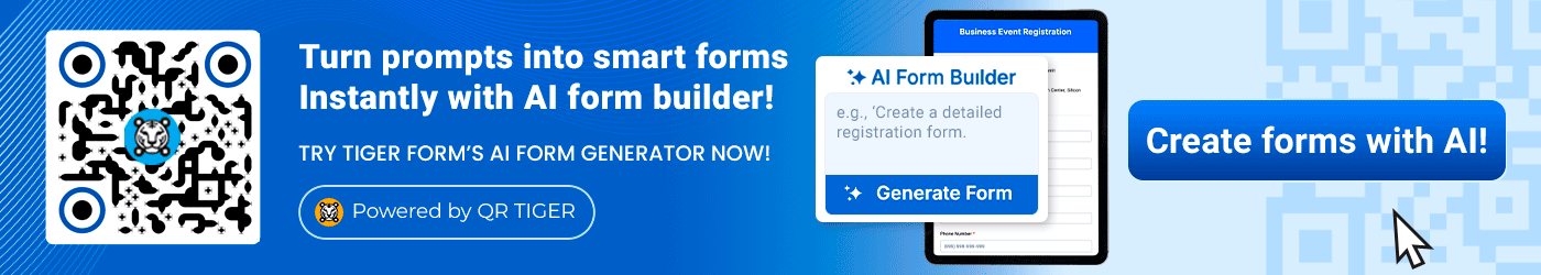
- This is one reason free online form creators like TIGER FORM use blue in their logo and interface design. The color helps create a modern, organized, and user-friendly experience.
- Blue-themed form templates can feel more approachable, professional, and easier compared to overly bright or distracting designs.
- Blue also works well with neutral colors like white, gray, and black, making digital interfaces look cleaner and more readable.
- In user experience design, blue is often associated with clarity and simplicity, which helps users feel more confident while navigating a platform.
- Even small design choices like color can shape how trustworthy, comfortable, and professional a digital experience feels to users.
Create professional blue-themed forms with TIGER FORM
Blue is one of the easiest colors to work with in online forms because it feels clean, calm, and trustworthy without trying too hard. When someone opens a form, the design immediately affects how comfortable they feel while filling it out. A cluttered or overly bright form can feel tiring, but blue usually creates a smoother and more balanced experience.
TIGER FORM uses blue in its design because online forms are not just about collecting information anymore. They’re part of the user experience. The layout looks less overwhelming, the questions feel more approachable, and the overall experience becomes smoother from start to finish. Blue also works naturally with modern minimal designs, which helps forms look polished without feeling too crowded.
That’s what makes blue such a smart choice in form design. It feels professional without being too formal, simple without looking plain, and modern without trying too hard. With customizable form templates and clean layouts, TIGER FORM uses blue to create forms that people actually feel comfortable interacting with.
Blue never goes out of style
Trends change constantly, but the blue color always finds a way to stay relevant. It creates emotions people naturally connect with. It can feel peaceful, trustworthy, confident, emotional, or modern depending on how it’s used. That balance makes blue work across almost every generation, culture, and design style.
FAQs
What is the actual reason the sky is blue?
The sky looks blue because of a process called Rayleigh scattering. Blue light from the sun spreads more easily through the atmosphere than other colors, which is why our eyes see the sky as blue during the day.
What does blue color signify?
Blue color usually represents calmness, trust, peace, stability, confidence, and reliability. Depending on the shade, blue can also feel professional, emotional, luxurious, or relaxing.
What is the rarest blue?
One of the rarest and most valuable blue shades in history is ultramarine blue, which was originally made from the rare stone lapis lazuli. Naturally occurring true blue pigments are also very rare in nature.
Is blue a warm or cool color?
Blue is considered a cool color. It is often linked with the sky, water, winter, calmness, and relaxation, which is why it creates a refreshing feeling.
What are the best blue color combinations?
Some of the most popular blue color combinations include blue and white, navy blue and gold, blue and gray, teal and beige, and royal blue with black. These combinations are widely used in fashion, branding, websites, and interior design.
What is blue symbolism?
Blue symbolism is commonly connected with peace, trust, wisdom, stability, calmness, and confidence. In different cultures, blue can also represent spirituality, protection, and emotional depth.