
When it comes to speed, QR codes are the clear winner. People are already signing up when they scan the code. This ease of use is what makes a QR code membership form the most popular choice to go from interest to action in an instant.
For membership sign-ups, every extra step means fewer people will convert. QR codes remove these drop-offs by immediately linking people to a sign-up form when they’re ready. If it’s on a poster, counter stand, flyer, or screen, the QR code meets people where they are and lets them join instantly.
Read on to understand how to structure, place, and optimize your QR code membership form for faster, high-converting sign-ups with the help of a form creator.
What makes a QR code a membership form the fastest way to sign up
A QR code membership form is simple. It works on mobile devices, so it opens up when someone scans the QR code with their phone. With a smooth form sharing with QR code, there’s nothing to download and nothing to type in. The form loads immediately in the browser and is ready to be filled out.
That speed comes from making the process easy. One scan takes you to the form, and one quick submit completes the sign-up.
Because the process is so fast, people don’t just give up. When joining takes only a few seconds, instant sign-ups happen naturally.
Now, here’s what it can bring to your table:
- Opens instantly on any smartphone with a single scan
- Works directly in the mobile browser, no apps required
- No need for manual typing and long sign-up URLs
- Let users complete membership sign-up in seconds
- Captures high-intent sign-ups at the exact moment of interest
- Reduces drop-offs caused by slow or complex registration steps

The ideal structure of a high-converting membership form with examples
1. Short, benefit-focused headline
The headline is the first thing people see, so it should quickly explain the benefit of joining. Aim to answer “Why should I join?” in one clear sentence. And keep it professional and avoid hype. A good headline lets people know what to expect and makes them more likely to start filling out your form.
Example: “Join Our Members Club for Exclusive Updates and Offers”
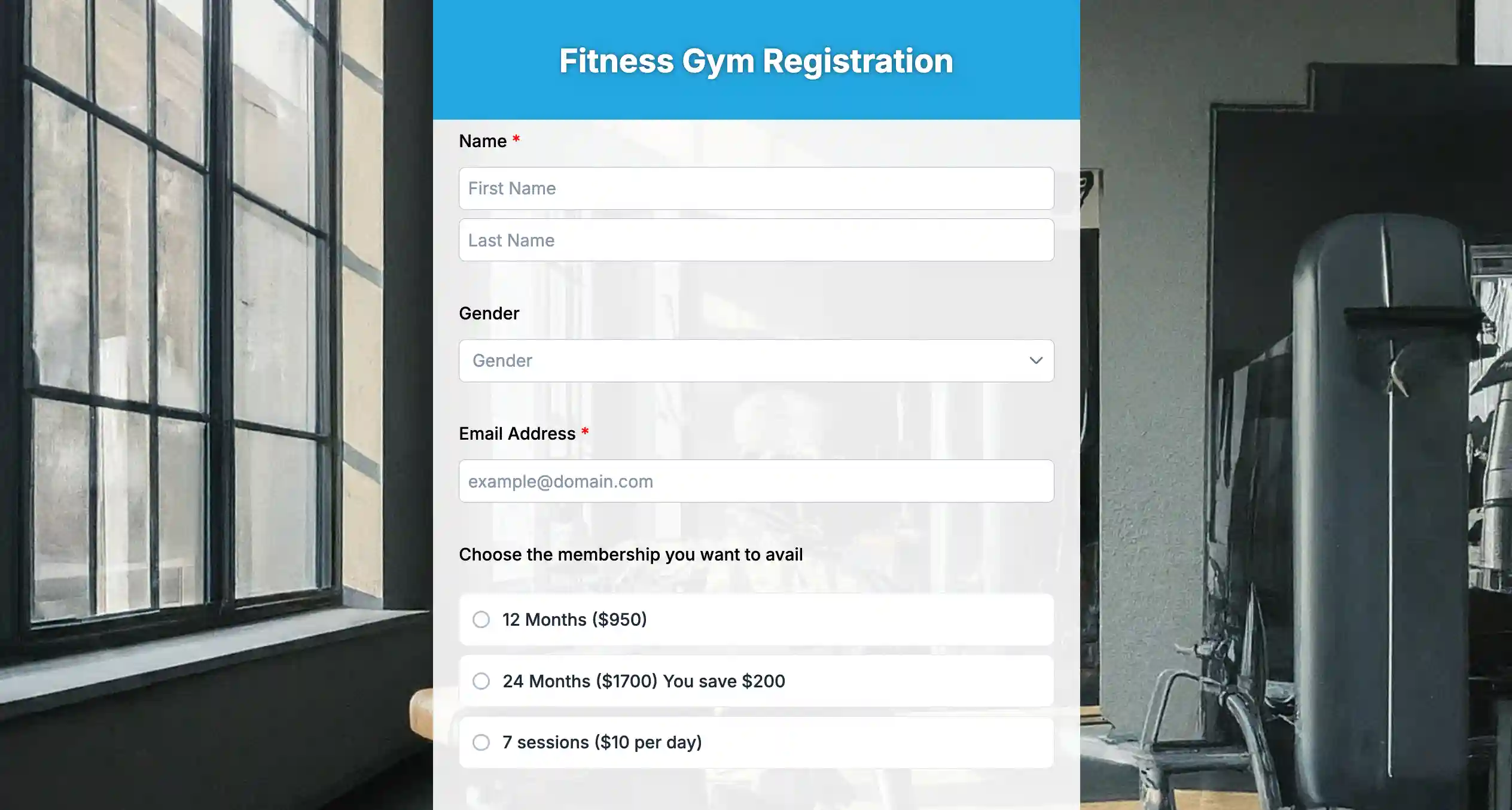
2. Only 3–4 essential fields
The more fields you add, the harder it is to sign up. A high-converting membership form only asks information that is absolutely required. Keeping the form short makes it feel quick and easy, especially on mobile devices.
Example: Full Name, Email Address, Phone Number
3. Optional, simple membership plan selection
If you offer different membership plans, keep the choices simple and easy to spot. Avoid long descriptions or side-by-side comparisons that force users to think too much. Simple labels help users choose quickly without interrupting momentum.
Example:
– Free Member
– Premium Member
4. Clear and visible consent checkbox
A consent checkbox builds trust and keeps you compliant, but it shouldn’t get in the way. You can put it near the end of the form so users can review it naturally after entering their details. Keep the wording simple so it doesn’t raise unnecessary questions.
Example: “I agree to receive membership updates and accept the terms.”
5. One strong, action-driven CTA button
Your CTA button should tell people exactly what happens after submission and encourage them to act now. Avoid generic text like “Submit.” Direct language reassures users and nudges them to complete the sign-up without second-guessing.
Example: “Join Now” or “Get Instant Membership Access”
Where to place the QR code for instant sign-ups

Even the best QR code membership form won’t work if people can’t see it. Placement should match intent. You need to place the QR code exactly where people are already engaged, curious, or waiting.
Front desk and check-in counters
This is the strongest spot for instant sign-ups. People are already talking to your staff and asking questions. A visible QR code lets you say “Scan to join” and get them to sign up straight away.
Checkout counters and payment areas
Right after a purchase, trust is high. Placing a QR code near the payment terminal or receipt tray turns satisfied customers into members while the experience is still fresh.
Entrance doors and lobby walls
Entrance areas are great for catching attention early. A QR code with a simple message like “Scan to Join Our Community” sets the tone before people move on.
Waiting areas and seating zones
This is prime scanning time. People are already on their phones and not in a rush. A standee or wall poster nearby makes joining feel effortless instead of forced.
Event booths and demo tables
After a chat or demo, interest peaks. You can put a QR code directly on the table or backdrop allows instant follow-through without exchanging contact details.
Posters inside restrooms or hallway transitions
These spaces often get unexpected attention and dwell time. A well-placed QR code here can quietly drive sign-ups without competition from other messages.
Receipts, flyers, and takeaway materials
These extend the sign-up opportunity beyond the moment. Even if users don’t scan immediately, the QR code stays with them and invites action later.
9 mistakes that slow down QR code membership sign-ups
If you’re wondering why the QR code is not working, the problem usually isn’t the QR code itself. It’s about where you put it, what the form looks like, and what happens after someone scans it.
Below are some reasons that you should avoid:
1. Too many form fields
Long forms feel like work, especially on a phone. Asking for details like address, date of birth, or job title at sign-up makes people just want to drop their phone and give up.
Example: A form with 10 fields instead of just name and email leads to drop-offs halfway through.
2. QR code without instruction text
A QR code alone doesn’t explain what happens next. If users don’t understand why they should scan, they won’t.
Example: A QR code on a poster without “Scan to Join” or “Scan for Membership” gets ignored.
3. Desktop-only or non-mobile-friendly forms
People scan QR codes on their phones, not desktops. Forms designed for large screens force users to zoom, scroll sideways, or struggle with tiny buttons.
Example: A wide, multi-column form that looks fine on desktop but is frustrating on mobile.
4. No confirmation after submission
If people don’t see a clear success message, they’re left unsure if the sign-up worked. This creates confusion and repeated scans.
Example: Submitting the form and landing on a blank page with no confirmation.
5. Poor QR code size or low contrast
If your Q codes are too small, blurry, or blend into the background, people won’t be able to scan them easily as you’d expect.
Example: A light-gray QR code printed on a white poster that fails to scan under indoor lighting.
6. Placing the QR code too far from the action
You want the form in front of people the moment they’re interested or ready to join.
When the QR code is placed far from where conversations or transactions happen, that momentum fades. People get distracted. They start another task. And they tell you they’ll do it later.
Example: A QR code posted on a back wall instead of at the front desk, where questions happen.
7. Overloading the form with explanations
Long paragraphs and instructions slow reading and increase hesitation.
Example: Explaining membership terms in full before the submit button instead of linking to them.
8. Weak or unclear CTA text
If people don’t clearly understand the CTA, they hesitate. The button should tell them exactly what will happen next. Generic words feel neutral and don’t build confidence, while specific language reduces doubt and encourages action.
Example: A button labeled “Submit” instead of “Join Now” or “Get Membership Access.”
9. Slow-loading form pages
Even a few seconds of delay feels long on mobile. Slow load times cause people to give up before the form appears.
Example: A form loaded with heavy images that takes several seconds to open after scanning.
Easy steps to create a QR code membership form with an online form creator
If you want instant sign-ups, your process needs to be quick, too. Here’s how to create a QR code membership registration form easily in minutes by using an online form builder, TIGER FORM.
Step 1: Choose a ready-made membership form template
Open TIGER FORM and pick a membership form template. This gives you a pre-structured layout with essential fields already arranged for fast sign-ups.
Step 2: If you’re unsure, use the AI form builder
If you’re not sure what to include, use the built-in AI form creator.
Simply type a prompt like:
“Create a simple membership form for a gym with essential fields only.”
The AI will automatically:
– Suggest the right fields
– Organize them clearly
– Keep the layout clean and minimal
– Recommend a strong CTA
This removes confusion and speeds up the creation process, especially if you don’t want to design everything manually.
Step 3: Optimize for mobile
Since the form will be accessed through a QR scan, make sure it’s mobile-friendly.
Check button size, spacing, and readability. Keep the headline short and benefit-driven, such as: “Join Our Members Club in Seconds.”
Mobile optimization ensures the experience feels effortless after scanning.
Step 4: Enable form QR codes
Once your form is ready, use TIGER FORM’s built-in form QR codes feature.
Instead of using a separate QR generator, the platform instantly creates a QR code linked directly to your live membership form.
Step 5: Use dynamic QR code integration
With QR code integration inside TIGER FORM, you can:
– Edit the form without changing the QR code
– Track scan performance
– Update membership details anytime
This is important because you won’t need to reprint posters or flyers if something changes.
Step 6: Test the scan-to-submit flow
Before launching, scan the QR code from different devices.
Make sure the form loads instantly, fields work smoothly, and the confirmation message appears after submission.
Test like a user, not like the creator.
Step 7: Download and place your QR code form
Download your QR code and place it where sign-ups are most likely to happen:
– Front desk counters
– Event booths
– Checkout areas
– Posters and standees
Pair it with a short instruction like:
“Scan to Join Instantly.”

Your next member is one scan away. Make your QR code form today!
You’ve seen how even small delays can cost you sign-ups. Now imagine removing them completely. A QR code membership form catches people’s interest the second it happens. No follow-ups. No “I’ll do it later.” Just one scan and done.
People are most likely to join when they’re engaged—at the front desk, after a purchase, right after a conversation at your booth. If it takes more than a few seconds, momentum drops. A QR code membership form keeps things moving.
Your next member doesn’t want a long sign-up process. They want something quick and easy. Build your membership form with a form generator and let one scan turn interest into instant membership.
FAQs
1. How do I create a QR code membership form for my business?
You can create a QR code membership form using an online form creator like TIGER FORM, which offers ready-made templates, AI form generation, and built-in QR code integration. Once the form is ready, the platform generates a dynamic QR code that links directly to your live sign-up page.
2. Why is my QR code membership form not getting sign-ups?
If your QR code membership form isn’t converting, the issue is usually friction. Common problems include too many form fields, unclear CTA text, poor QR code placement, or a non-mobile-friendly layout. Simplifying the form and improving visibility often increases instant sign-ups.
3. Can I edit my QR code membership form after printing the QR code?
Yes, if you’re using a dynamic QR code. A dynamic QR code membership form allows you to update fields, change membership plans, or modify content without changing the QR code itself. This means you don’t have to reprint posters or marketing materials.