
Form design is your first chance to make a great impression online. Seventy percent of users decide within 10 seconds whether to complete a form or abandon it.
A well-designed form feels smooth, inviting users to interact, complete tasks, and confidently share valuable information. When forms are intuitive and responsive, users are more likely to complete them, return for future interactions, and engage meaningfully with your brand.
On the other hand, poor design can frustrate users, lower conversion rates, and lead to incomplete or inaccurate data.
A form should guide users effortlessly, remove friction at every step, and inspire confidence that their time and information are being valued.
In this article, you’ll explore the essential principles of design, how to apply them effectively across web and mobile interfaces, and top form builders to design forms.
What is form design?
Form design is the process of creating user-friendly forms that help people enter and submit information online. It’s a key part of web design and user experience, affecting how users interact with everything from login screens to order forms. It focuses on the layout, visual hierarchy, input types, and interaction patterns that make forms intuitive and efficient.
At its core, design is about clarity and ease. A well-designed form feels natural to use. It asks for just the right amount of information, in the right order, with clear labels and helpful cues along the way.
Good design also builds trust and communicates professionalism. When a form looks polished and functions smoothly, it reassures users that their information is in safe hands. This is especially important for forms that collect sensitive data like payment details or personal identification. On the flip side, a disorganized or outdated form can raise red flags, making users hesitant to complete it.
When done well, it reduces errors, shortens completion time, and improves the accuracy of the data collected. Even small design choices like where you place labels or how you structure fields can influence how people behave. That’s why thoughtful, user-centered design makes the experience better for everyone.
Why a good design matters
Design in forms might seem like a small detail, but it greatly impacts both the user experience and your bottom line. From a user’s perspective, forms should feel easy and intuitive. If they’re confusing, too long, or hard to use on mobile, people are likely to abandon them.
On the business side, this translates to missed leads, lost sales, or poor-quality data. When forms are designed to be clear, logical, and easy to use, people are much more likely to complete them. Using a form builder allows businesses to tweak layouts, test versions, and improve the experience without coding.

Core principles of effective design
Designing an effective form is more than just arranging fields. When collecting meaningful data, whether through brand surveys or customer feedback, the quality of your form design can make or break the response rate.
Modern form builders now include AI form generation to assist users in creating well-designed forms. They don’t just speed up setup; they also suggest layouts, question types, and logic that follow good design practices. This helps you create forms that look professional, flow smoothly, and encourage more complete responses. Now, for more guided decisions in building your forms, here’s how each core principle works in practice:
Clarity
Clarity is the foundation of any good form. Every field should have a clear, descriptive label, and users should know exactly what’s expected of them. With a form builder, you can easily add tooltips, placeholder text, and custom error messages that provide immediate feedback. This eliminates guesswork and reduces user frustration, especially during long or complex submissions.
Example: Instead of a vague field like “Details,” you can use form tools to relabel it as “Tell us more about your request (max 200 words),” making it more specific and user-friendly.
Simplicity
Asking only for what’s necessary respects your users’ time and increases the chance they’ll finish the form. Most modern platforms support conditional logic, allowing you to show or hide fields based on user responses. This keeps the form clean and focused, especially on mobile devices.
Example: If someone selects “Business Inquiry,” only business-related fields appear, hiding irrelevant ones like “Personal Preferences.” This targeted approach makes forms faster and easier to complete.
Accessibility
Inclusive design ensures that your form works for everyone, including people using screen readers, keyboard navigation, or assistive technologies. A good form tool helps meet accessibility standards (like WCAG) by generating properly structured HTML, associating labels with inputs, and enabling keyboard-friendly navigation.
Tip: Always test your form with a screen reader or accessibility checker built into the form tool to ensure all users can complete it comfortably.
Visual hierarchy
Visual hierarchy helps users process information quickly. Key actions like the “Submit” button should be more prominent, while less important elements (e.g., optional fields) should be visually secondary. Using a form builder, you can group related fields with headers, adjust font sizes and colors, and organize the layout to match the natural reading flow from top to bottom, left to right.
For instance, when designing a feedback form with QR codes, it’s crucial to keep the layout simple and clear. Since users often access these forms on mobile devices by scanning a QR code, grouping questions into distinct sections with clear headings and ample spacing makes it easier for users to navigate and complete the form without feeling overwhelmed. This approach not only enhances professionalism but also reduces cognitive load, increasing the likelihood of more accurate and complete responses.
15 best practices for designing forms

Creating a form that people actually want to complete requires more than just dropping fields onto a page. Every interaction should feel smooth, purposeful, and easy. Whether you’re building a registration form, survey, or checkout process, following these best practices will help you improve form usability, reduce abandonment rates, and gather cleaner, more accurate data.
1. Keep forms short and focused
One of the quickest ways to lose a user is by overwhelming them. Long, complicated forms increase cognitive load, forcing users to think too much, often leading to drop-offs.
According to the Baymard Institute, the average checkout has 11.8 form fields, but most sites could reduce that by 20–60% without hurting usability. Whenever possible, ask only for the information you truly need. If your form must collect more data, consider breaking it into multi-step pages. This makes the process feel more manageable and gives users a sense of progress.
Tip: A progress bar or “Step 1 of 3” indicator reassures users that they’re not stuck in a never-ending process.
2. Use logical field grouping
Organizing related fields into clear, labeled sections makes your form easier to scan and understand. This helps simplify the feedback process and gives better results. For example, grouping fields under headings like “Personal Information,” “Shipping Address,” and “Payment Details” helps users mentally process each part of the form without confusion.
Form builders often provide drag-and-drop sections or field blocks, making it simple to structure your form intuitively.
Tip: Avoid random or out-of-order questions, as it makes users second-guess whether they’re doing it right.
3. Label fields clearly and consistently
A good form is like a conversation; you should never make users guess what you’re asking. Always include visible, clear labels above or beside input fields. Avoid relying solely on placeholder text as labels, since placeholders disappear once a user starts typing, increasing the chance of errors.
Top-aligned labels tend to work better for mobile users because they’re easier to read on smaller screens, while left-aligned labels can be fine for desktop when space allows.
Example: Instead of labeling a field just “Phone,” try “Mobile Number (include area code)” for better clarity.
4. Design for mobile responsiveness
With most users accessing forms from their phones, a mobile-friendly design is non-negotiable. Forms should adjust to different screen sizes without breaking the layout. Fields should be easy to tap, dropdowns should be thumb-friendly, and call-to-action (CTA) buttons should be large enough to avoid accidental clicks.
You can also minimize typing effort by offering dropdowns, radio buttons, or toggles for common responses instead of open-text fields.
Tip: Keep padding around form fields generous so users can tap easily, even on smaller devices.
5. Use inline validation and helpful error messages
Real-time validation catches errors as users type, allowing them to fix issues instantly instead of getting frustrated at the end of the form. For example, if someone types an invalid email address, an inline message like “Please enter a valid email” should appear right next to the field.
Error messages should be clear, polite, and helpful, and avoid generic or overly technical language.
Do this: “Password must be at least 8 characters and include one number.”
Not this: “Error 142: Validation failed.”
6. Default values and auto-fill options
You can speed up form completion by adding smart defaults (like pre-selecting a country based on IP address) or enabling browser autofill for common fields like name, email, and address. This reduces friction and improves the overall experience.
However, be mindful of privacy concerns. Users should always be able to review or change any pre-filled information before submitting.
Tip: Use the autocomplete attribute to help autofill fields like name, email, and address, which are common in any well-designed form template.
7. Optimize CTA buttons
Your CTA is the final nudge to get users to submit the form, so it needs to stand out and inspire action. Use clear, action-oriented language like “Sign Up,” “Book Now,” or “Get My Quote,” not vague phrases like “Submit” or “Click Here.”
Design-wise, the button should have a strong contrast with the background, be easy to tap (especially on mobile), and be placed where users naturally finish reading. Removing unnecessary fields can also boost the effectiveness of your CTA. For example, Expedia removed the “Company” field from their booking form, simplifying the process and making it easier for users to complete the form. This chan
Example: A bright, full-width “Continue to Payment” button at the bottom of a checkout form increases conversion more than a dull, gray “Next.”
8. Minimize optional fields
Each optional field you include adds friction and makes users pause. Even when marked as optional, users often feel compelled to fill them out—or worse, question why the information is even being requested.
Only include fields that are essential to the form’s purpose. If additional information would be “nice to have,” consider collecting it later through follow-up emails or progressive profiling.
When you must include optional fields, label them clearly (e.g., “Company Name (optional)”) and position them in a way that doesn’t interrupt the form’s primary flow.
9. Use progress indicators for multi-step forms
Multi-step forms often outperform single-page versions when designed well. They create a more digestible user experience and can guide users through complex data entry processes. However, without clear progress indicators, users might feel lost or unsure how much more is left.
A visual progress bar or a simple “Step 2 of 4” label helps manage expectations and builds momentum. It signals progress and motivates users to continue, especially when they’re close to completion.
This tactic is especially effective for onboarding flows, checkout processes, or multi-page surveys.
10. Avoid captchas when possible
CAPTCHA serves a purpose, keeping bots out, but it can be frustrating for real users. Blurry images, confusing puzzles, and poor mobile usability can all cause legitimate users to abandon your form.
If you need bot protection, use non-intrusive methods like honeypot fields (invisible to users but attractive to bots) or Google reCAPTCHA v3, which runs in the background without requiring user interaction.
Always prioritize user experience over unnecessary friction. Security should never come at the expense of usability.
11. Provide clear success messages
Once the user clicks “Submit,” don’t leave them in the dark. A well-crafted success message confirms that their action was successful and can offer next steps like checking their email, downloading a file, or returning to the homepage.
Example: “Thanks for signing up! Check your inbox for a confirmation email.”
This reduces post-submission anxiety and reinforces trust. Consider using a thank-you page for added clarity and the opportunity to offer related content or calls to action.
12. Allow users to save and resume later
For long or complex forms like job applications, grant submissions, or surveys, users may not be able to complete everything in one sitting. Providing an option to save progress and return later significantly improves form completion rates.
This feature not only makes your form more user-friendly but also shows respect for the user’s time and context. Some form platforms also offer auto-save features that store progress locally until submission.
Include a “Save and Continue Later” button in a visible place and offer instructions on how to return to the form securely.
13. Use visual cues and icons
Visual cues help guide users and clarify meaning. Icons next to fields (like a lock for secure payment or a calendar for date selection) offer instant recognition and confidence. Color highlights, tooltips, and subtle animations can also enhance comprehension without overwhelming the interface.
However, avoid overusing visuals. Using them purposefully to enhance clarity and reduce friction too many can be distracting or confusing.
14. Enable keyboard navigation and accessibility
Your form should be usable by everyone, including people with disabilities. This means ensuring that all fields are navigable via keyboard (tab, shift-tab, enter), compatible with screen readers, and designed with proper contrast ratios.
Use semantic HTML elements, associate labels with fields using the “for” attribute, and test your forms for accessibility using tools like Axe or Wave. Accessible forms aren’t just ethical; they also improve SEO and reach a wider audience.
15. Test, iterate, and monitor form performance
Form design isn’t a set-it-and-forget-it task. Use analytics tools to monitor drop-off points, heatmaps to track user behavior, and A/B testing to experiment with different versions.
You might discover that changing a single word in your CTA or reordering your form fields improves submission rates dramatically. Keep refining based on data, not guesswork.
A form that evolves with your users’ needs is always more effective than one that’s static.

Common mistakes to avoid
Even with the best intentions, small mistakes in design can create significant roadblocks for users. These issues don’t just cause frustration but can lead to lower completion rates, inaccurate data, and a poor overall user experience. Below are some of the most common missteps to watch out for when building forms, especially when using an online form builder platform.
Overusing required fields
It’s tempting to mark every field as required, especially when gathering complete information. But asking for too much can overwhelm users or feel intrusive. If users don’t understand why a piece of information is needed, they may abandon the form entirely.
Only mark essential fields as required. If additional information is helpful but not critical, consider labeling those fields as “optional.” A good form builder lets you control required fields with just a click and use that feature sparingly and thoughtfully.
Ignoring field validation
Without proper validation, users can easily submit incomplete or incorrect information. Worse, they may not realize their mistake until they hit the submit button and get a vague or confusing error message.
This creates unnecessary friction and slows the process down. Enable real-time (inline) validation so users receive instant feedback while filling out the form. For example, flag an invalid email address as soon as it’s typed, not after submission. Most modern platforms offer inline validation features you can customize to match your form logic.
Inadequate error feedback
It’s not enough to tell users something is wrong, and you need to explain what’s wrong and how to fix it. Vague messages like “Invalid input” or “Field required” can confuse and frustrate users. Write clear, specific error messages and position them next to the affected field. For instance, instead of saying “Invalid password,” say “Password must be at least 8 characters with one number.” Use visual cues (like red highlights or icons) to make the issue easy to spot.
Poor spacing and layout
Crowded forms with inconsistent spacing make it hard for users to scan, understand, and complete fields. If users have to stop and think about where to click or what to type, they’re more likely to drop off. Use consistent padding, logical grouping, and plenty of white space to make the form feel breathable and organized. Form builders with drag-and-drop design tools let you preview layouts on different screen sizes and use this to ensure your spacing and alignment work across devices.
Misleading CTA Text
Your form’s CTA should clearly communicate what will happen when the button is clicked. Generic or confusing labels like “Submit” don’t provide enough clarity, especially if your form involves a specific action like booking, downloading, or subscribing.
Use action-specific CTAs like “Request a Demo,” “Start Free Trial,” or “Send Message.” Also, ensure your CTA button stands out visually with contrasting colors and an adequate size. Many platforms allow you to customize CTA text and styling, and take full advantage of that to improve engagement.
Top form builders to help you design better forms
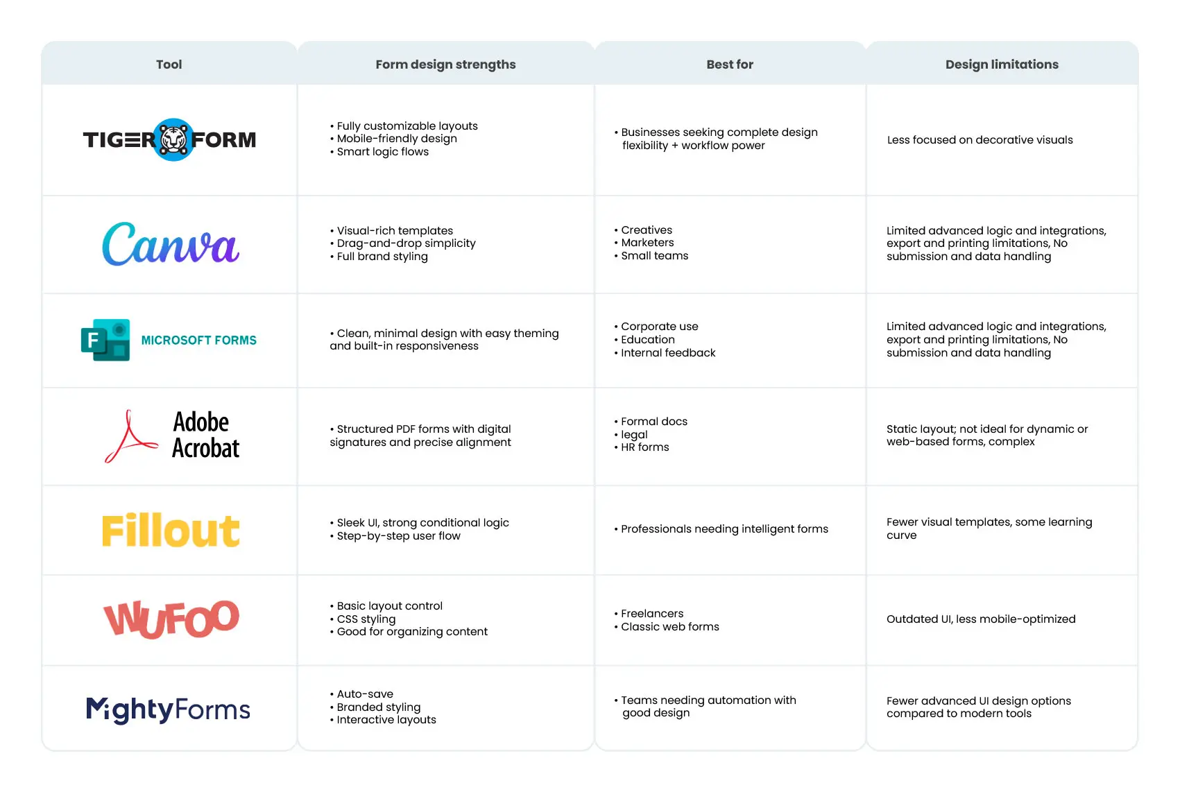

Start designing better forms today with TIGER FORM
A good form should feel easy to fill out, so easy that users hardly have to think about it. Every time someone clicks, types, or scrolls through your form, it shows how easy or difficult it is for them to share their information with you. When a form is thoughtfully designed, it becomes invisible, guiding users effortlessly from start to submit. But when it’s poorly designed, even the most interested visitor can become a lost opportunity.
That’s why applying proven form design best practices is critical. Keeping forms concise and mobile-friendly, to offering real-time validation and clear CTAs, each decision you make directly impacts user experience and conversion rates.
A versatile form creator like TIGER FORM helps you implement these principles with a platform built for simplicity, flexibility, and results. And the journey doesn’t stop once your form is live. The best forms are shaped by user feedback, refined, adjusted, and improved over time.
Start creating your form today by visiting our website and exploring innovative, easy-to-use forms built from pre-designed templates.
FAQs
What is a form design?
It is the process of creating the layout and structure of a form to collect user data effectively. It focuses on clarity, usability, and visual appeal to enhance user interaction.
What are the 7 elements of design?
The seven design elements are line, shape, color, texture, space, form, and value. These are the foundational tools used to create visually balanced and effective designs.
What is a form of UX design?
Form UX design ensures that forms are easy to use, intuitive, and user-friendly. It aims to streamline user input, reduce errors, and improve the overall experience.
What is a form example?
A common example is a contact form that collects a user’s name, email, and message. Other examples include sign-up, feedback, or registration forms on websites.